Collaborative Association of the Lower Mainland
A collective of professionals choosing healing over harm in separation support.

Branding that brings legal, financial, and emotional professionals together to guide families forward with care.
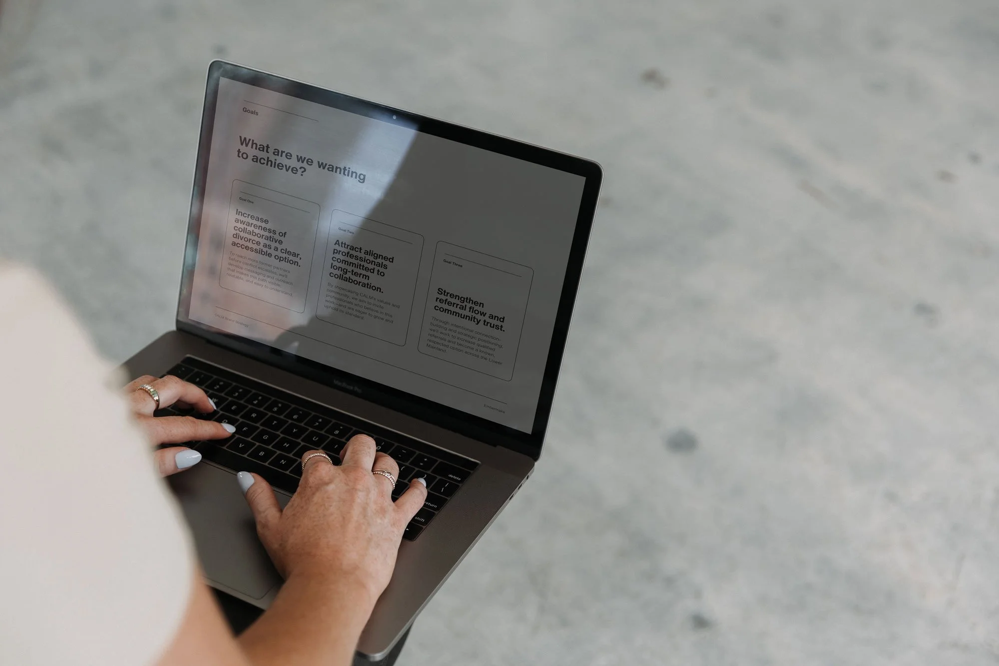
When we began this work, CALM’s impact was undeniable, but like many associations made up of diverse professionals, the challenge was in the articulation. Their work was powerful, but hard to describe without slipping into jargon or sounding overly technical. So we started where it mattered: deep strategy, clear positioning, and shared language. We built a foundation around their values, tone of voice, and mission—while still leaving space for each practitioner to show up as themselves within the collective. From there, we hosted a Brand Embodiment Workshop with members and created a custom visual identity designed to feel steady, professional, and deeply human.
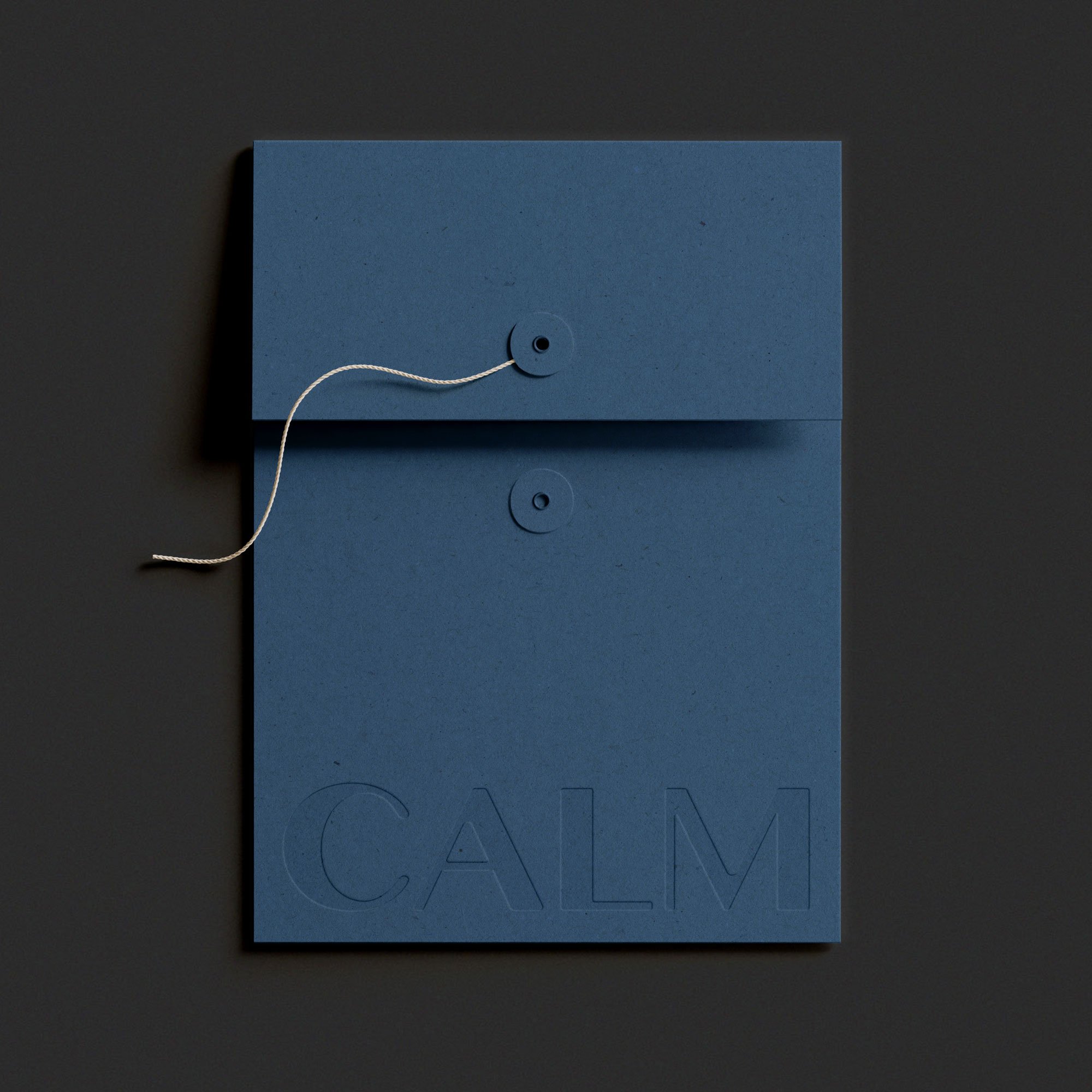
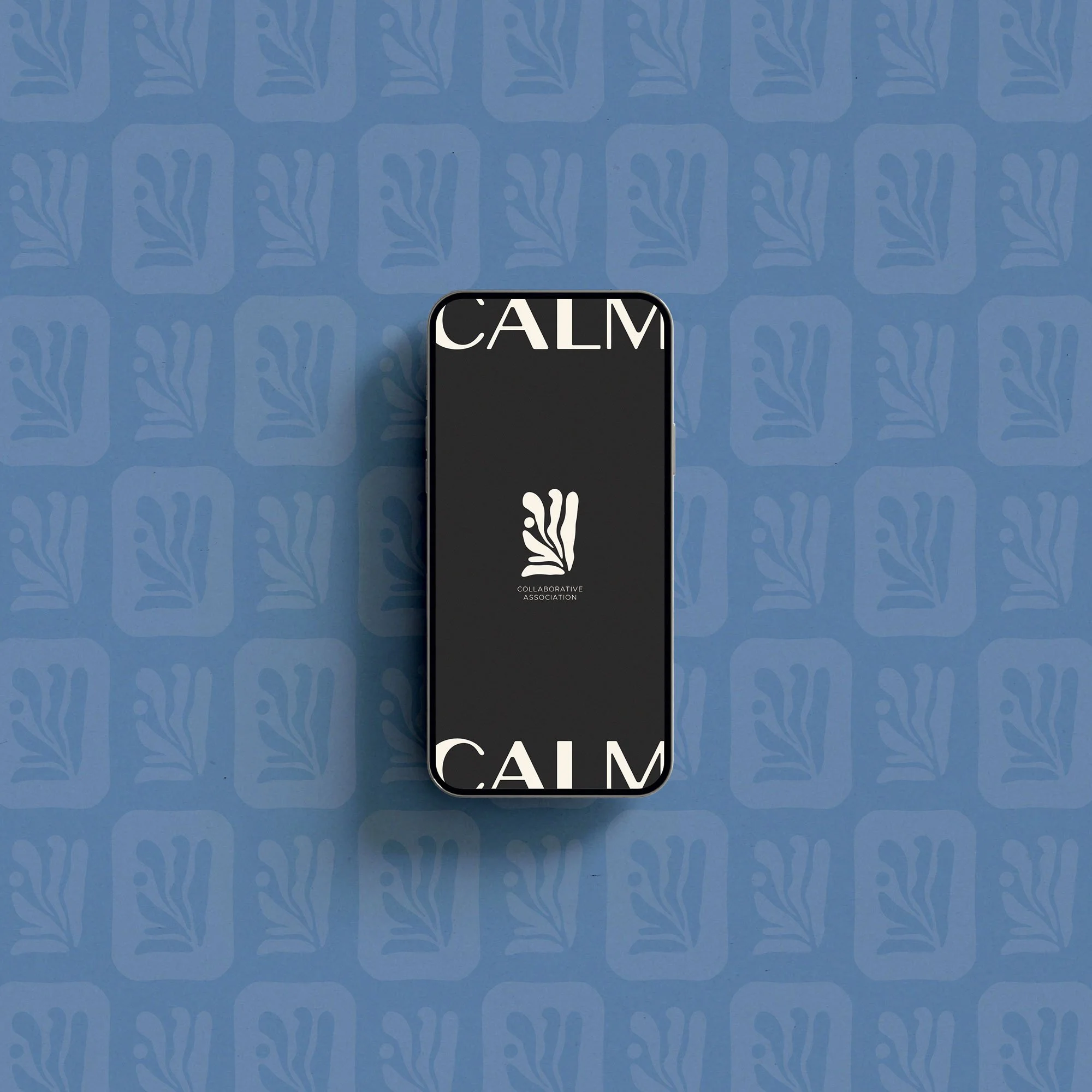
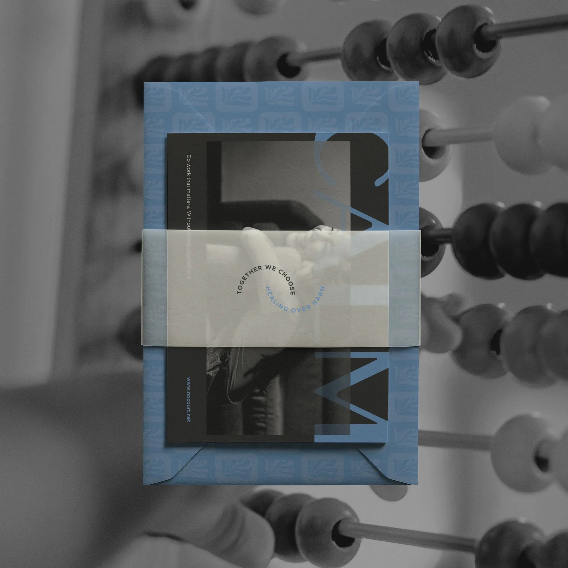


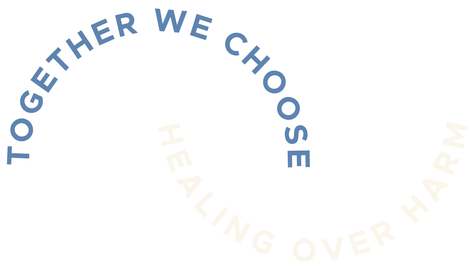
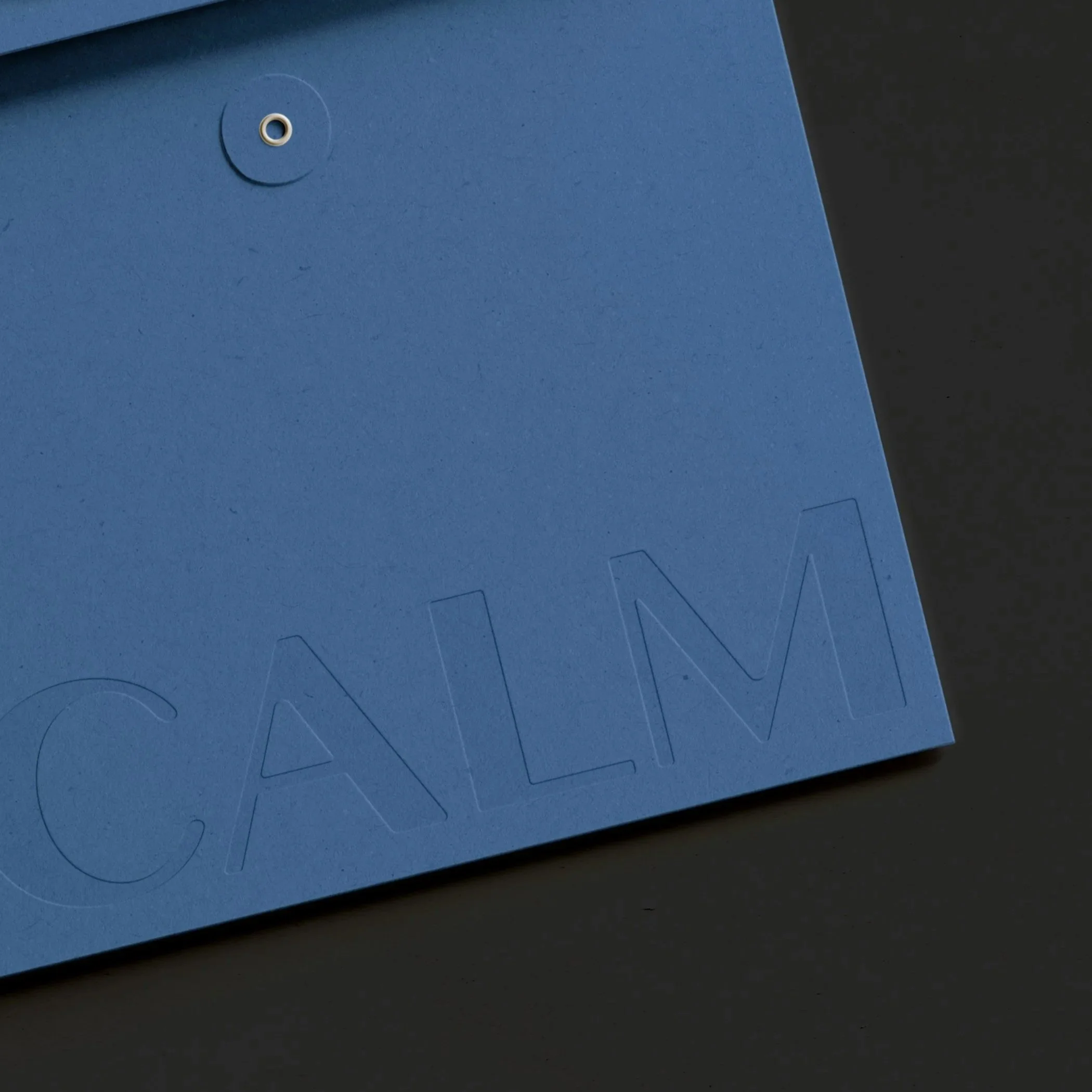
A visual identity designed to convey calm authority, an anchoring presence in a season that often feels uncertain.
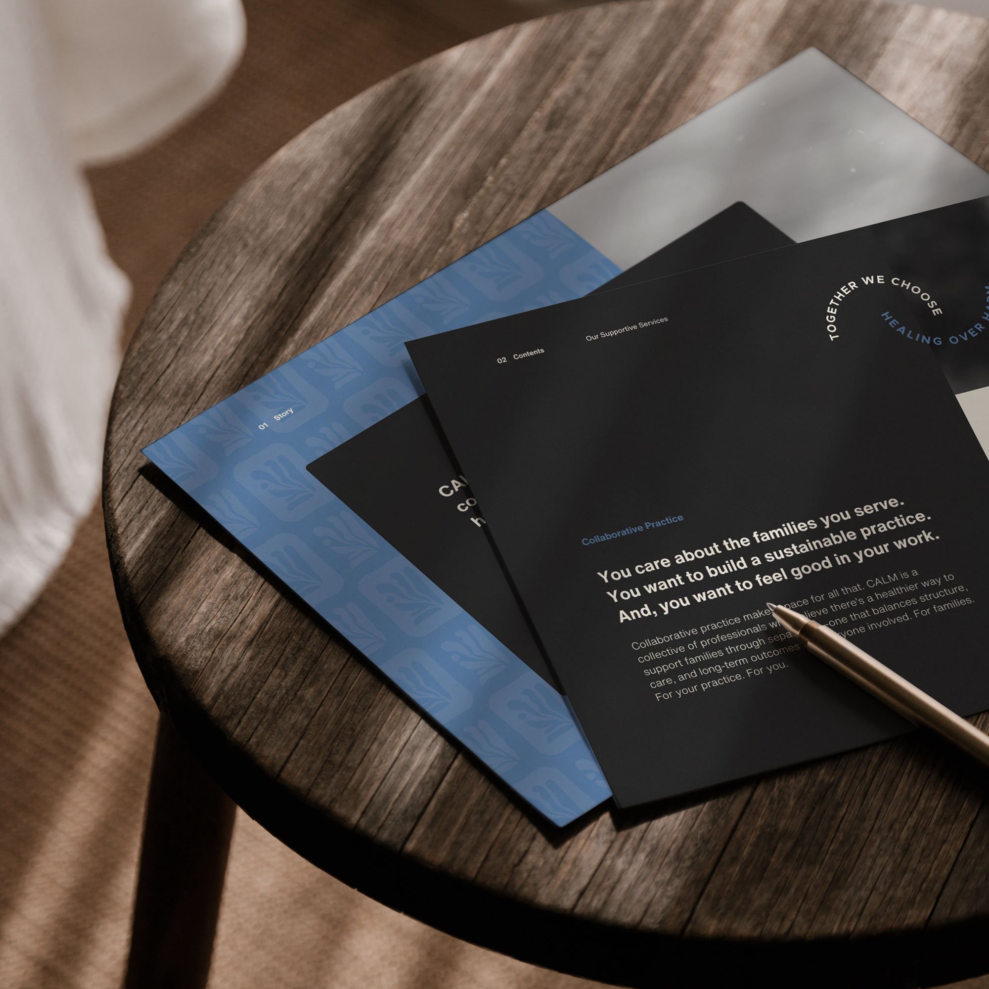
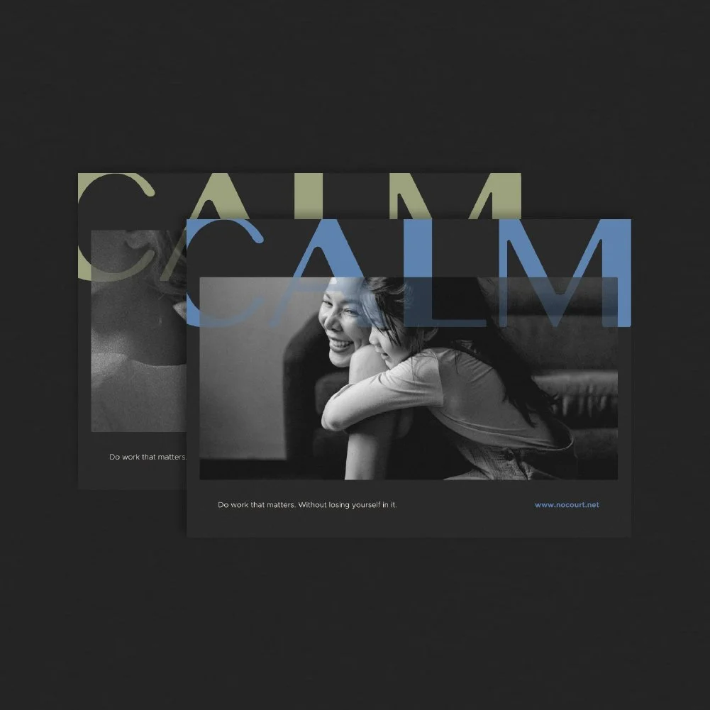
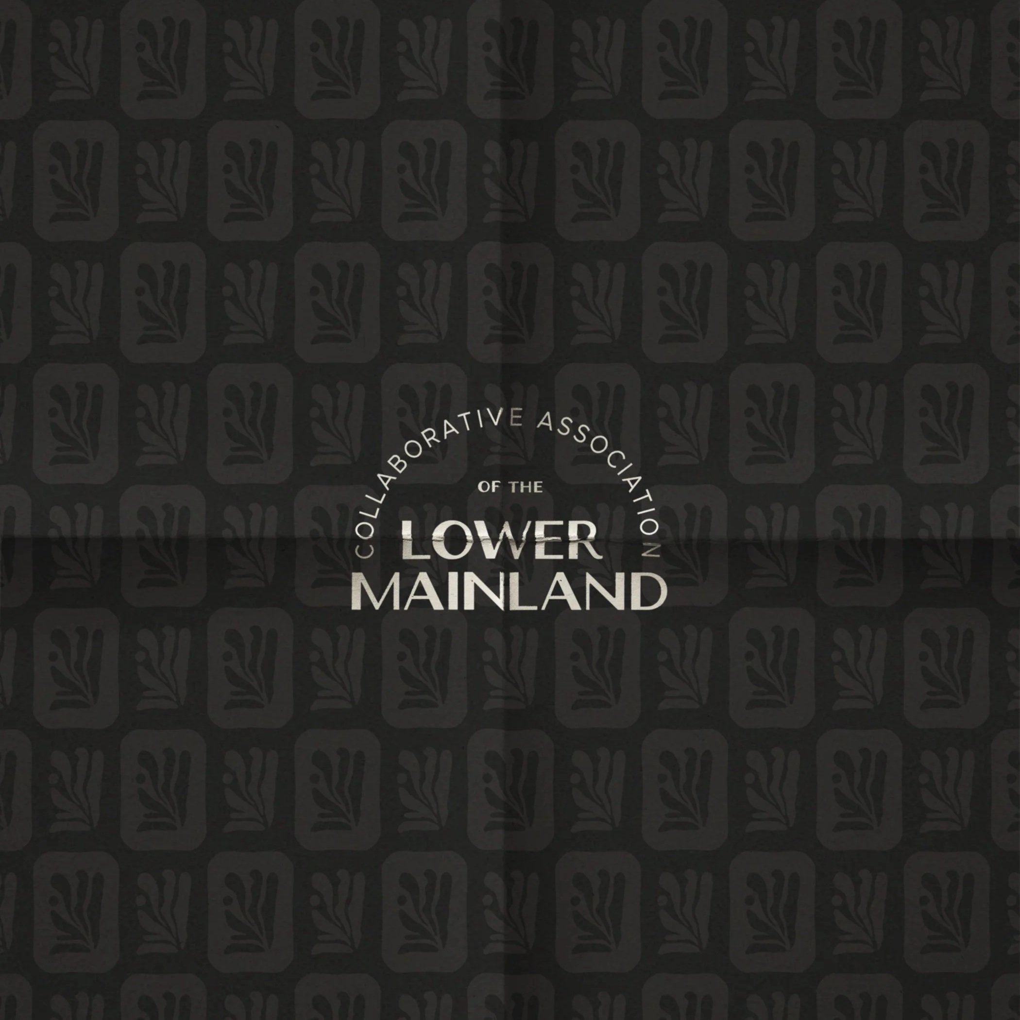
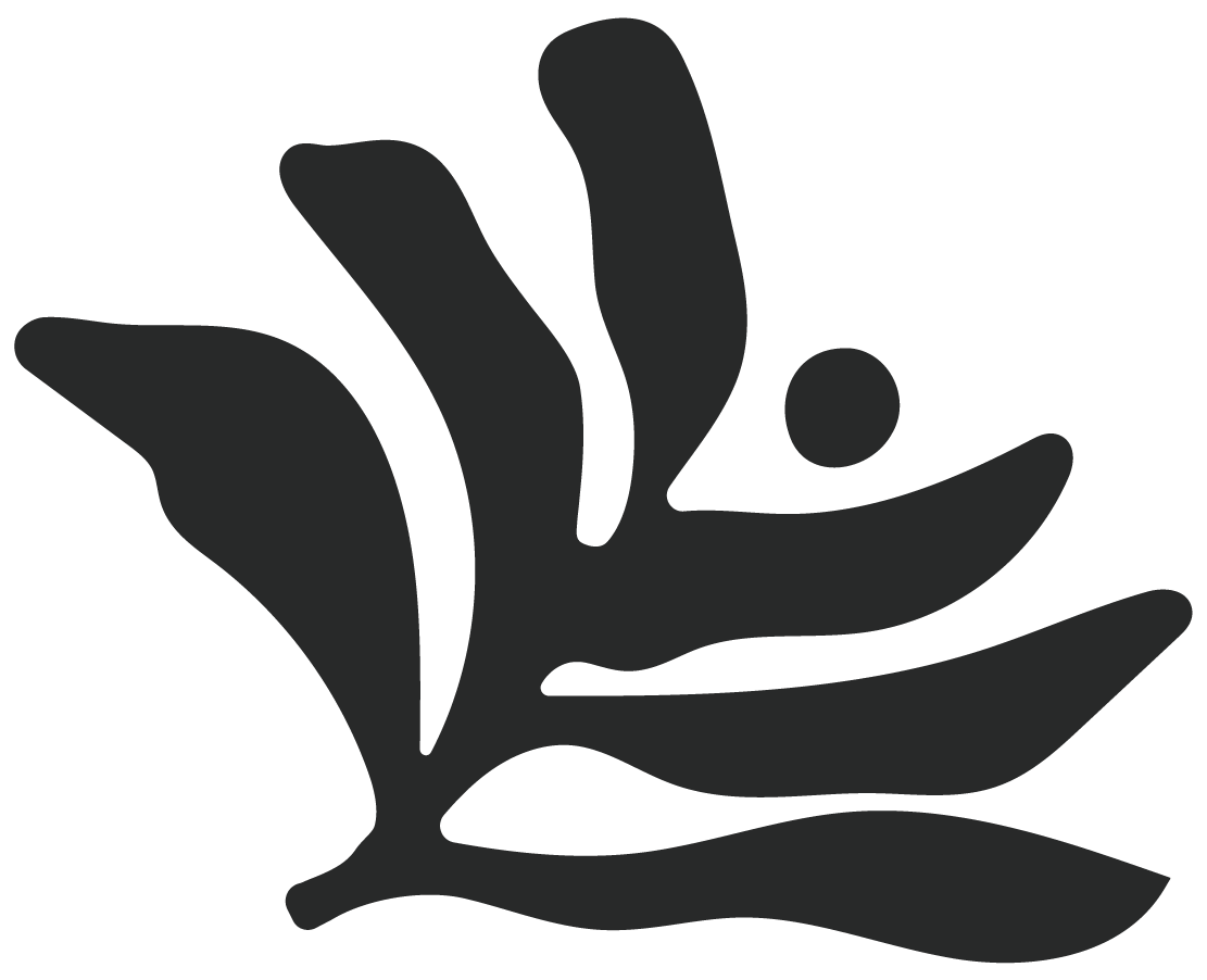
Layered, organic forms in the logo reflect collaboration and resilience, representing many moving parts held together with intention. Across the system, balance is everything: clarity without harshness, professionalism without rigidity. Custom typography and considered proportions create a confident identity that carries consistently across both digital and print—positioning CALM as a trusted guide for families and professionals alike.